

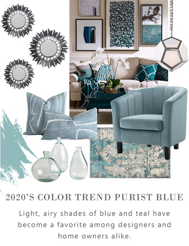

The color forecast 2020 has in store for us offers a versatile palette of misty blue, teal, eggshell and aqua. These hues come together in a color called Purist Blue. The Purist Blue palette is relaxing to the eye, but it also shows range by seamlessly complimenting an array of décor styles, metal finishes, patterns and themes. 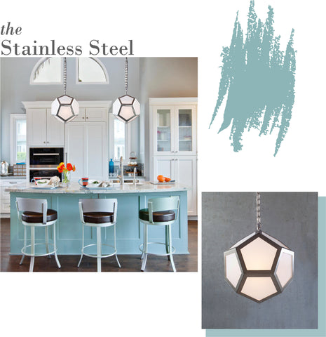
SHOP LAMONT PENDANT
Whether your décor scheme focuses on a more transitional thread with cool tones, or a more contemporary palette with lots of color and pattern, these misty hues fits in well and exceed expectations. This palette is a beautiful compliment when it comes to spaces using polished nickel, stainless steel and chrome finishes. The subdued hints of green undertone help create something more dynamic and current to this decade where natural elements are inspiring interior design, and shades like Sage have become a go-to choice.

Purist blue is defined by an airy-lightness, mixed with similar shades to create a tonal palette. These ethereal tones inspire wonder and tranquility in any space—especially when it comes to transitional design. Purist Blue tones make beautiful kitchen cabinetry and accent walls. Tie it all together with a few well-appointed accent pieces that help elevate the space. Designer pillows and clear hand-blown vases are just a few of the options available.

Purist blue is perfect for creating a tranquil space with modern touches. Client Spotlight : Home Life Interiors creates an immediate sense of peace when walking through the entrance of this luxury condo. Our Venus Box Geometric Pendant Light features a cage of polished stainless steel—making a bold statement in this sleek transitional abode.

Purist Blue can serve as accent pieces, but it can also make a statement all it’s own. With the popularity of Parisian Design bringing more traditional elements back into the picture, there’s no better time to experiment with your lighting choices. Our Marcella chandelier features a tried-and-true classic silhouette--yet is made new by striking blue Murano glass.

For those with a more contemporary, colorful lean, this color palette will also serve you well when paired with warm-toned metals. Adding Purist Blue to a brass and gold laden décor scheme may seem like an unnatural choice, but the outcome is anything but ordinary.

The Purist Blue palette carries a retro undercurrent—making it a seamless partner in more Art Deco and Mid Century décor schemes. Client Spotlight : Jennifer Welch Interior Design styles six of our Lamont Pendants with eye-popping pattern and color. This break room has a restaurant feel—creating a space that inspires creativity and collaboration among the staff.

The key to taking the Purist Blue palette in a more Maximalist direction is to focus on the darker, richer shades of teal. These vibrant colors come to life when juxtaposed with gleaming brass, bronze and gold. Choose pieces that are unique, artful, textured and sculptural.

Black and white motifs are a friend of the Purist Blue palette. These patterns build contrast, and are reminiscent of the Art Deco age when shades of aqua reigned supreme in architecture and interior design. Creating an air of regal grandeur helps build an atmosphere of refined glamour and tasteful decadence.
Written by Chelsey Loya